Mobile applications have become the synonym of comfort, fast use, and simplicity. But does it always happen that developers and designers manage to release such a product that rings the bell with the audience and conquers several app stores? Unfortunately, many of them make mistakes that are often taken by other development companies. As a result, some bad design of UI decisions spread in other apps. This article will view the most typical mistakes in mobile UX.

Interesting Facts
- Almost 50% of the time developers spent on fixing bugs in UX.
- Only 55% of companies carry out UX tests during the development process.
- Well-designed UX increases conversion almost by 400%.
- A business may lose up to 50% of its users if its website isn't optimized for mobile apps.
- 2/3 of online minutes are spent on mobile devices.
These facts stand for the fact that UX plays one of the most important roles in creating mobile application, and so mistakes in mobile UX may cost a pretty penny both for developers, and a client.
1. Estimate the app before using it
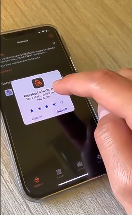
Recently you might have found the displeased talks on using iOS app UPNP Xtreme. As the developers state, it allows playing streams from such servers as Plex. However, not all the users that downloaded this app managed to estimate its functionality. When a user first launches the app, he/she is asked to leave a review. You can’t close this alert without leaving a review. The button “Skip” just doesn’t work and if you press on some outer point, you will see no reaction. The only way out is to give the app 3, 4, or 5 stars. There is a question of how the App Store allowed this incident to happen. However, after the tidal wave, the app was deleted from the store. Though it had been downloaded by many users.

What’s wrong: the practice of adding the rating pop-up is quite popular. It allows getting feedback from users and increases the rating of the app. However, it’s recommended to add this tab after some time spent in the app. So a user could at least learn its main functions. In other cases, this pop-up may cause only anger and will inevitably lead to deleting of the app.
2. “Helpful” messages
The popular WhatsApp messenger differs by the user-friendly and clear interface. However, it also has its falls. If you mistakenly sent a message to the wrong person or just want to delete one of the messages, you can easily do this. But your chat will forever see this message:

Probably, this message will cause more questions than just “Sorry, sent you the message by mistake”. That’s why it’s not clear still why the developers don’t remove it.
What’s wrong: many other messengers also provide the opportunity to remove your message in a dialog or group chat without leaving this kind of “rudiment”. In fact, that’s not removing but blocking the message content. That doesn’t live up to users’ expectations. You should either inform the user about this or really fulfill the function.
3. Hidden functions of the app
Sometimes developers release quite a complicated app containing a variety of functions and opportunities. But users know and use just some of them. This happens to the app Spotify that was officially launched in Russia. Apart from the audio player, there is one more important feature. Users can publish their own podcasts, analyze their content and monitor the listening time.

However, the practice shows that this opportunity often remains neglected by users. It is hidden in the navigation menu and is not that obvious.
What’s wrong: if the app navigation is difficult or inexplicitly leads to some functions, then this interface is considered bad. In this case, the question arises: is there any sense in saving this feature? If the answer is positive, you should better work out the navigation in the app. Or you should think about removing this feature at all.
4. Notifications about new messages VK
One more example of a bad UX was shown by the popular social network VKontakte. Some periodical design updates have already get into the habit. Though it doesn’t concern push notifications. They have become so annoying that some users prefer to turn off them at all. Notifications in VKontakte inform you about new messages, birthdays of your friends, mentioning of your id in your chats and replies to your comments. But the developers recently have added one more type of notifications. If you don’t read a message during several hours you are likely to receive the following notification:

Moreover, if you just turn off all the notifications you will receive it anyway. But the text will be “Turn your notifications on so that you didn’t miss the message from…”
What’s wrong: annoying push notifications make other users turn the notifications off in the settings. So that leads to their futility at all.
5. Useless tabs
The lower tab bar of any app should have a minimum number of tabs so that the app didn’t become heavy and the navigation was clear and easy. But sometimes the apps possess tabs that are neither functional nor informative. For example, the streaming platform Hulu in one of the versions has the similar tab:

To view the details of a user account you should go to the official website. But why should they make a separate tab for that?
What’s wrong: the basis of a user-friendly app is the design ergonomics. Every button and every button should provide some function. If the tab is only meant for redirecting, it can be moved to settings. That will help you to save simplicity in the main tab bar.
6. Hidden functions
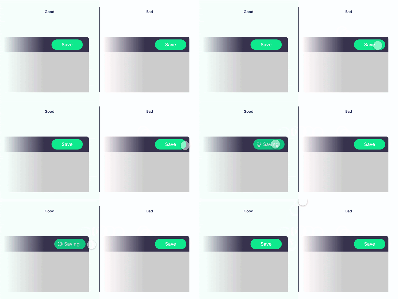
Knowing and understanding inner development processes is not necessary for every user. But the work of some functional elements is important for clear interaction with the app. That’s why you can sometimes see the mistake when the processes are not shown to a person. For example, trying to press the button “Save”, it isn’t changing and a user can’t understand whether it has reacted.

What’s wrong: any user action should react and signify the starting information processing. If nothing happens, a user may think that the app slows down or this action can’t be fulfilled. To escape this you should implement animation and additional markers pointing at the app reaction.
7. Obvious process
Developers often explain some obvious things considering that a user has no idea what’s going on in the app. For example, by pressing the button “Sign in” in the app Fitbit a user may see a pop-up with the message that he/she will be now redirected to the registration page.

What’s wrong: these actions shouldn’t necessarily be commented on. The process of transferring from one screen to another happens quite fast. So, there is no need to inform about this. The efforts should be better spent on the optimization process.
8. Too strict password requirements
The security of an app is one of the most important parameters. In the race of making the app secure, the developers may neglect the easy user experience. It relates as well to the creation of a user’s account password. As the statistics show every user is registered in 9 social networks. This means, that everyone is aware now of the basic requirements for a password. It should be less than 8 symbols, contain Latin letters and special symbols.
However, many developers go further and write very limited rules in the requirements. At least one lowercase and one uppercase letter, at least one digit, one special character, length from 8 to 12 characters, the password must not match the previous 5 passwords, must not contain part of your e-mail address, and so on.

What's wrong: too complex requirements for creating a password can scare the user away from the application. No one wants to strain themselves too much at the registration stage. It is better to pay attention to ensuring security in the application not at the expense of the user, but in accordance with various documents and requirements. Provide a minimum set of requirements for the user and, if desired, include an additional question. Moreover, you can avoid having to enter the user's password twice by simply providing a button for the visibility of the entered password.
9. Autoplay videos in the Netflix app
This feature appeared back in 2015 and was not immediately liked by many users. If you open the information for any movie or TV series, you will see a preview at the top: a trailer, an excerpt from an interview with the cast, etc. Autoplay turns on constantly, so even if you just want to see the list of actors and the year of release of the film, you will still see a preview with sound.

What's wrong: any "auto" feature in the app is an imposed choice for the user. The developers seem to decide for their users that they will definitely want to watch the trailer with the sound turned on. If you want to provide a similar feature in your product, set the silent mode by default at least.
10. "Creative" approach to function buttons
Surely, everyone has faced situations when he had difficulties downloading the necessary file or document. The difficulty was to find the" right" button, that will lead to the link. Different styles, symbols, the use of bold and italics for the text, and much more... As a result, often instead of one link, the user can see several, and it is difficult to guess which one he needs.
What's wrong: in addition to the fact that some non-working buttons may contain harm to the user's smartphone, other links are ads for third-party services and sites. Such deception will not cause anything but dissatisfaction of the user. Avoid multiple buttons for a single action, leaving the interface simple and clear.
What should You Do to Prevent This?
Such mistakes in mobile UX indicate that at some stage of development there were misunderstandings between the parties to the product, or product managers neglected the convenience of the application for commercial goals. Anyway, only close and transparent work with the development team can help to avoid such situations. This is one of the principles of our team, so if you want to create a truly high-quality product, we will be happy to help you!


